
Using colour in visual dynamics
Placing complementary colours alongside each other gives you maximum contrast between
your hues. Using Day-Glo colours and strong contrast can create powerful visual dynamics
that feel as if they’re actually vibrating. However most of the time design requires colour
combinations that are less dynamic, which is where secondary and tertiary colours come in
as well as tints and shades. Balancing colours requires you to identify which colours are
dominant and which ones are subordinate; which ones you use sparingly to give an accent to your designs; and which ones take up the majority of the space but fall into the background.
Tints and shades provide a tonal quality to hues by making them lighter or darker. Tone plays an important part in design, by providing contrast between light, dark or ‘mid tone’ elements. Much of our thinking about tone comes from Renaissance painting where the term ‘chiaroscuro’ (Italian for light-dark) was used to describe the interplay of light and dark elements as well as using it to model three dimensional objects by using shading.

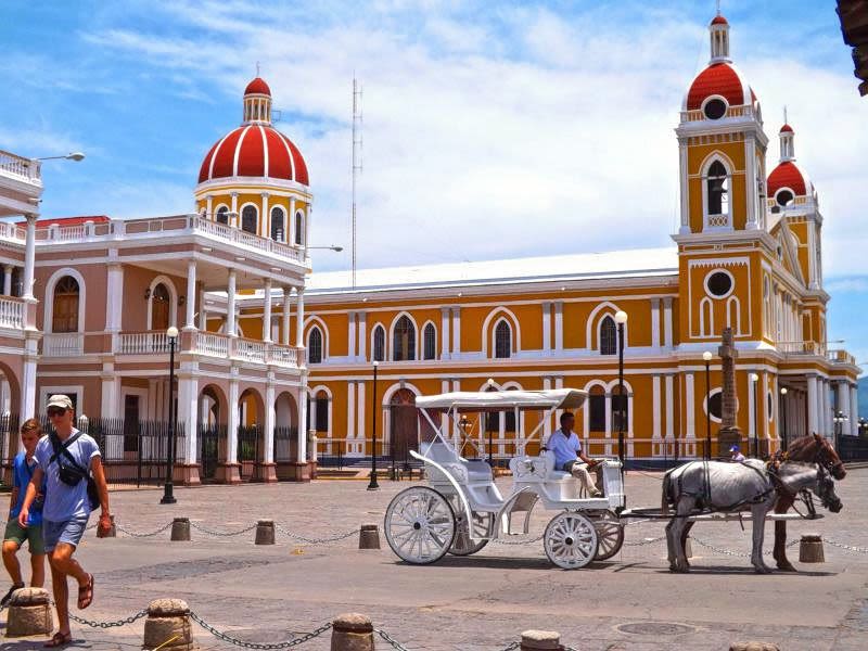
In this view of Beirut there is a limited range of colours that work well together. The white
and red are the dominant colours that work alongside each other to create a dynamic
contrast. The subordinate colour is the dark yellow ochre of the stone and the darker
shadows that creates their own contrasting dynamic in the background. The inclusion of the
dark panels on the stall create the maximum contrast drawing the eye in. The subtle tints
and shades of the green bottles and the washing up in the corner add a secondary level of
interest that helps keep our attention.
CMYK and printing colours
For designers there are two colour systems that are very important in understanding how
designs transfer from computer to printing. These are CMYK and Pantone or spot colours.
CMYK stands for cyan, magenta, yellow and key, representing the four colours that make up
all full colour printing, otherwise known as full colour process or CMYK process.

If you overlay cyan, magenta and yellow printing inks the section in the middle should be black, but because of impurities in pigments it is dark but never fully black, therefore black or ‘key’ is also used. Any full colour printed material will use CMYK, which is separated out into four printing plates and inked up using the CMYK colours. A fine dot is used so that the eye mixes the colours together to make the full colour spectrum, for example cyan and yellow dots will create the appearance of green.
Looking closely at colour printing in a newspaper will give you a sense of these dots as newspapers tend to use larger dots to deal with the coarse material of newsprint paper.
Spot colours
However, not all printing is CMYK, you can also specify ink to be made up to a particular
colour. These are known as spot colours and a lot of printed design only utilises two or three
spot colours instead of the four CMYK colours. Firstly printing two colours is cheaper than
printing four and secondly mixing exactly the type of colour you want at the inking stage
gives you a very different quality to relying on mixing the colours visually. To help identify
spot colour the Pantone system has been developed. Pantone colours come in physical
samples or swatches with a code (for example, Pantone Orange 021) that is the same in the
swatch, your computer and the printers’ inks so that exact colour matching can be
guaranteed.
All colours, including any photographs or imported illustrations, must be specified as CMYK
or Pantone before sending your artwork to a printer.
Exercise: Abstract Cities
Create a series of 10 abstract designs in which you balance blocks of subordinate,
dominant and accent colours.
These designs are going to be used as covers for guidebooks to the following cities:
- Madrid
- Malmo
- Marseille
- Melbourne
- Managua
- Manchester
- Montreal
- Mumbai
- Manhattan
- Marrakech
The books are going to be A5 landscape (210mm x148mm) size. You can use as many
colours as you like and need to include the name of the city – where you place this and
its colour are also important decisions to make. You may want to find out more about
each city to help you develop your colour palette and also the size, shape and positioning
of the colour blocks.
Explore your DTP packages further by creating the artwork in the different software
packages you have to experiment with the possibilities and ease of use. You can also do
this exercise on paper using coloured blocks that you can cut and move about.
Make notes in your learning log as you research and create your designs.

Exercise Response
To clarify my thinking’s, I began looking for examples of Accent, dominant and subordinate colours. Here were my findings:


Cities
I began researching each City. Trying to understand the different architectures, and how I might marry these Cities together as a ‘series’. Having never travelled to any of these Cities (other than Manchester, of course), it was amazing to learn of the different colours, textures, architecture and landmarks there are around the world.
Madrid

.
.


Malmo


Managua


Melbourne


Manchester


Manhattan


Marrakech


Marseille


Montreal


Mumbai


Abstract Inspiration
I went in search of abstract inspiration. Abstract comes in so many forms and is seen in photography, illustration, graphic design, architecture and so much more. Abstract is everywhere we look.
I focused my research mostly on architecture, as I was quite keen to replicate some of the famous landmarks that holiday makers might wish to see, in abstract form. Below are some of my favourite examples of abstract.


Guidebook Inspiration


Additional research
I searched for inspiration from fellow students. How did they respond to the exercise? What was their approach? Looking at it from another angle was helpful and insightful, but also made me realise that perhaps I had been over-complicating things in my own mind. Here’s what I found:
I loved this particular students work. Using tourist attractions / landmarks and recreating them in abstract block form but without giving away too much. Focusing on specific areas of each building / statue: http://graphics.learningpictures.co.uk/index.php/2017/05/20/exercise-abstract-cities/
Another completely different example from another student – To use shapes in certain textures that form an insight in to each City. A less obvious approach but nicely executed: https://hilarylawlerocablog.wordpress.com/part-3-2/exercise-5-abstract-cities
Abstract seems so simple until you’re trying to portray something that another can understand without them needing to use too much thought. I guess that’s the entire idea of Graphic Design, but abstract somehow needs to be relevant surely? Which isn’t always easy to see in some designs, in my opinion. At the same time, abstract seems to be an area very free and open to interpretation, yet simple in style. I feel this is an area I need to develop and feel more comfortable with.
As I progress through this course I begin to develop my own style. Abstract feels like one of those areas I may never feel entirely comfortable with. When brainstorming, ideas didn’t seem to come naturally to me, despite the research and inspiration I was inundated with….
Not sure exactly where I was going with this, I got on with some sketches.
Sketches


Building ideas

This was my first attempt at an abstract globe. First impressions – Horrific. Not only does it not feel at all ‘abstract’ in comparison to other examples, but it also has a very ‘space-like’ vibe, which doesn’t work at all unless you’re planning on travelling to space.
I loved the idea of using coordinates, but for this exercise it couldn’t be used anyway, but it gave me some ideas for future projects.


I tried using popular destination photos and recreating them using different shaped blocks in colours I had taken from the photos to create myself a colour palette. This was a really useful exercise and showed me much easier ways to create detail and shadows using palettes in this way.
This concept was certainly more appealing but I couldn’t find a comfortable place for the typeface or a suitable colour that complimented all the others in the design. I then tried incorporating a flag inspired border for the text to sit on, again using colours from each flag. It was awful.
In the end this concept didn’t work for me, for a number of reasons. Mostly because it felt too cartoon-like and not abstract enough. I personally don’t believe it represents my style at all which I am trying to develop at the moment, and I’m not sure it would ever appeal as a travel guide.
A lot of time and effort went in to the detail in these and it just felt like an unproductive use of time for not very sufficient results. It was time to move on…

Instead I tried to simplify things, using the type as the focal point and texture that represents a connection with each City. I feel my knowledge of filters in the the vector software I use could be improved. I found myself aimlessly scrolling and adjusting buttons without any success, in an attempt to create a wall-like texture or something relevant to a particular landmark. It’s good to establish these gaps in my knowledge so that I can improve, but I felt unable to achieve what I needed to, to execute this series of guidebooks accordingly.
I did however quite like the idea of a prominent ‘M’. Although the positioning is different from my original sketches, it seemed to work and I could imagine it working as a series, as to create a consistency across all the designs, and emphasising the evident use of ‘M’s’, throughout this exercise.

Using the same layout as previous with a prominent ‘M’, and taking the Museum I recreated earlier (for it not to be a complete waste of time), I merged the two together. As well as this, and to add more abstract elements, I used shapes to imply certain letters in the typeface. I then used a colour from the Cities flag as the background.
So far this was my favourite concept!

Again, I had a play around with a concept I had started earlier, but using some of the famous buildings I had designed using blocks of colour instead, and incorporating the use of shapes as a border, and shapes in the typeface. It all seemed a little too much.
Designs
In the end I came back to my favourite and continued to recreate a series of landmarks made of blocks using palettes created from the photos I had attained during my research, and then applying a background colour taken from each Cities flag, and the type in a slightly darker tone than the background.


Conclusion
Overall, this exercise taught me that the use of abstract shapes, even in the simplest of forms, can imply certain objects. In this case, architecture. The use of a colour palette helps to define, add detail, and relevance to a subject. As well as textures that can also imply the look and feel of a specific environment.
I gained a much better understanding of abstract art and design, although this is an area I’m still not entirely confident in and feel there is a lot more to be understood and learned. I hope to build on this using the lessons I have learned during this exercise.
I am not entirely happy with my series of guidebooks. Again, my experience lets me down, but I guess that is the reason why I’m here – To learn. They are abstract and imply what they should, I’m just not sure if they’re as abstract as needed to meet the brief.
For this exercise I wanted a solid sans-serif font, that was bold and would work well with the blocks and shapes used to create each landmark. However, I didn’t explore many options and feel I played it safe.
A better understanding of how to apply specific textures in Inkscape is something I intend to do more of, as I feel my lack of knowledge in this area let me down in this exercise. That said, I will be moving on to more industry standard software in the next academic year.
